Mark Meacher
Home
CASE STUDY
BMW Electrified
Demystifying electric driving for consumers
Category: B2C Awareness
Overview
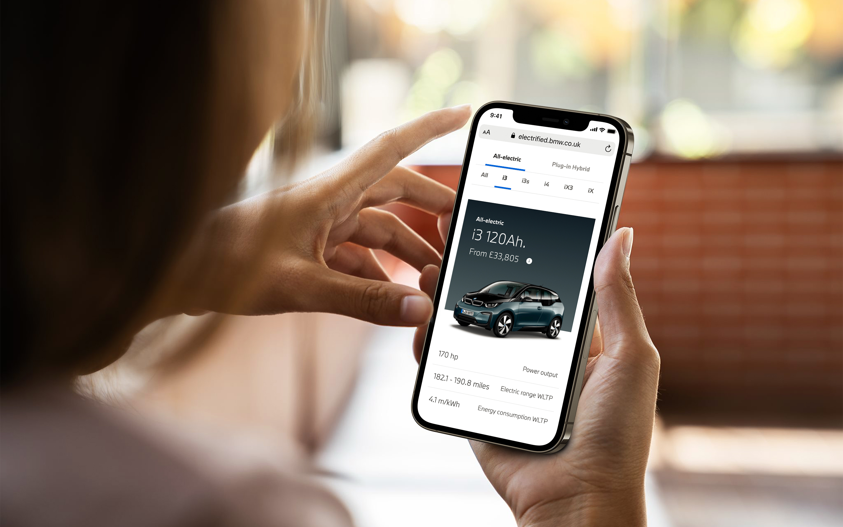
Nearly half of motorists are not ready to switch to electric vehicles, with concerns about price, range, and charging all holding buyers back. BMW needed an online solution to help alleviate these barriers to purchase for potential buyers.
The problem
BMW already maintained online electric driving resources but they were split across multiple sites and had different functionality and visual styles. The brand wanted to bring all of their electrified vehicle tools together into one, user friendly and central solution, allowing users to gain a holistic overview of the BMW electrified range and its benefits.
With electrified driving moving at such a fast pace, BMW also needed to simplify the back-end of the site, making it fully customisable should technical model data change and to ensure the latest model imagery could easily be displayed.
Approach
Research Phase
The initial “As a, I want, so that” research identified that the most prominent user need was to have the ability to see how much money drivers could save by going electric. This was broken down into two major categories, those that wanted to compare their exact ICE (internal combustion engine) vehicle specs to another electrified model to see accurate savings, and those that needed the flexibility of breaking the savings down by monthly and annual results so they could compare to their exact budget scenario. Secondary needs were focussed around learning more about electrified driving benefits.
Ideation phase
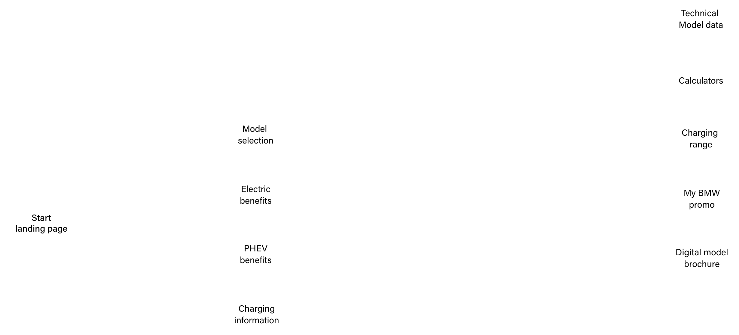
After conducting some initial user interviews and analysing the existing tools, the product team and I started to develop some early phase user flows. The initial research around this identified specific user needs such as feature specific requests as well as the overall experience. The team identified at this stage that two different calculators would be needed in order to display the data accurately and give users relevant results based on their requirements.
User journey mapping
UX Phase
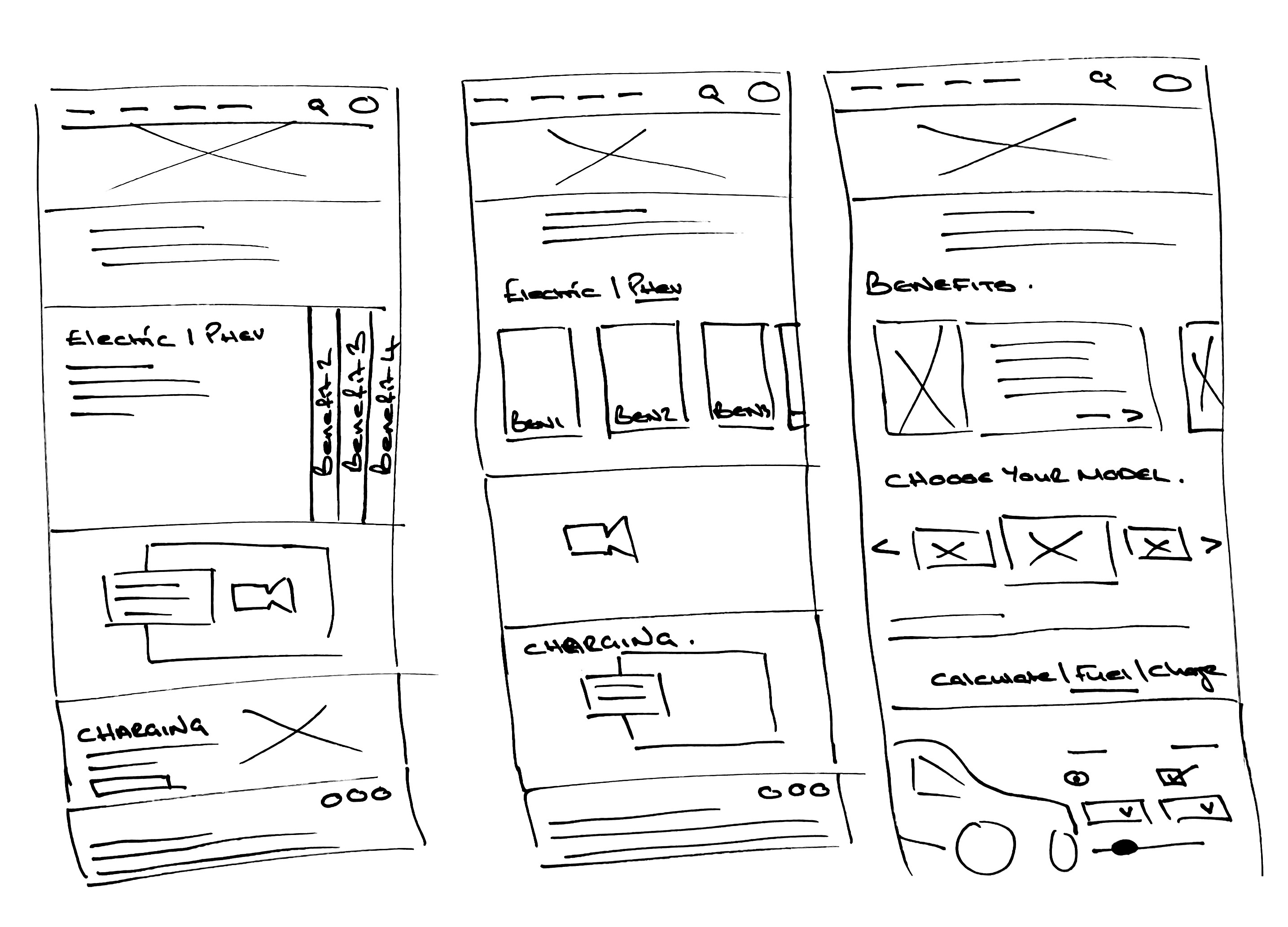
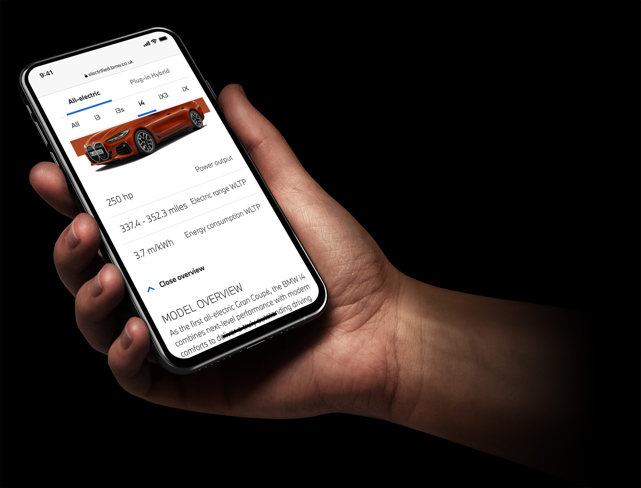
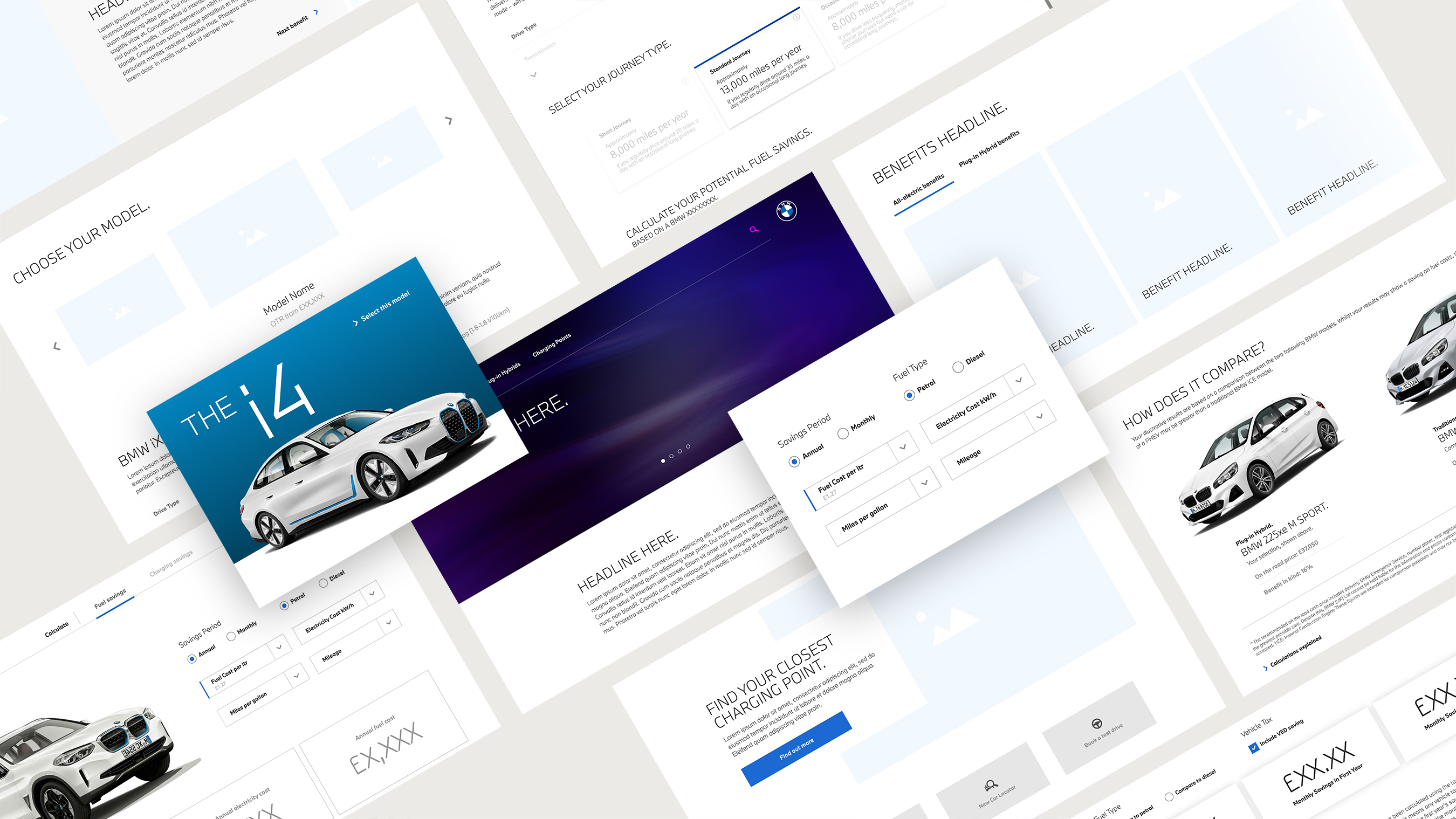
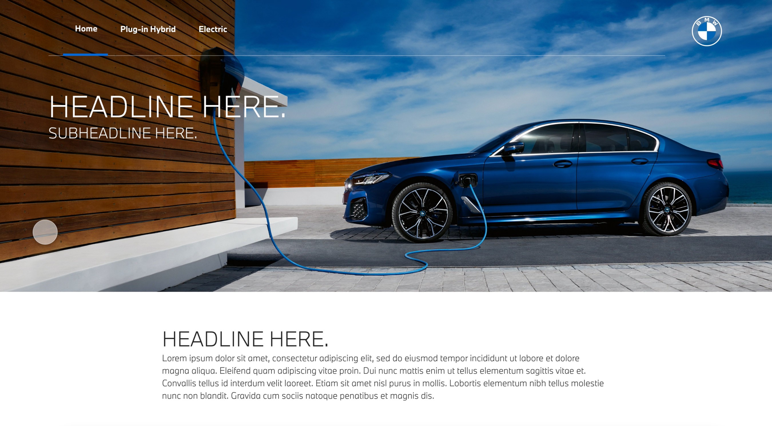
An early wire framing phase started with high-level scamps that included certain product features based on the user research. The team and I looked at ways of presenting the calculators as well as a benefits section to the user. This included different mechanisms and devices such as carousels, content drawers and video. Having produced the scamps, I then went on to develop medium-fidelity wireframes which looked to bring the content devices to life in more detail. At this stage, we could see more clearly the routes that worked best from an information hierarchy perspective and those which made the experience feel too bloated.
Design System
Another challenge with working cross brand on a tool like this was sizing and spacing of individual component areas. Fonts and weightings are very different across the two brands and could have caused real issues, especially as the team were staggering the design phases, BMW first and then MINI. To overcome this and to avoid any potential clashes during any of the design sprints, I worked with the designers to install a library system of branded components that could quickly be rebranded and checked for viability. This meant that as full scale designs were being made for a particular area of a site in any given sprint, designers could work along side that sprint, validating brand and design decisions across various elements.
Next Project

Mark Meacher
mark.meacher@gmail.com
Mark Meacher
Home
CASE STUDY
BMW Electrified
Demystifying electric driving for consumers
Category: B2C Awareness
Overview
Nearly half of motorists are not ready to switch to electric vehicles, with concerns about price, range, and charging all holding buyers back. BMW needed an online solution to help alleviate these barriers to purchase for potential buyers.
The problem
BMW already maintained online electric driving resources but they were split across multiple sites and had different functionality and visual styles. The brand wanted to bring all of their electrified vehicle tools together into one, user friendly and central solution, allowing users to gain a holistic overview of the BMW electrified range and its benefits.
With electrified driving moving at such a fast pace, BMW also needed to simplify the back-end of the site, making it fully customisable should technical model data change and to ensure the latest model imagery could easily be displayed.
Approach
Research Phase
The initial “As a, I want, so that” research identified that the most prominent user need was to have the ability to see how much money drivers could save by going electric. This was broken down into two major categories, those that wanted to compare their exact ICE (internal combustion engine) vehicle specs to another electrified model to see accurate savings, and those that needed the flexibility of breaking the savings down by monthly and annual results so they could compare to their exact budget scenario. Secondary needs were focussed around learning more about electrified driving benefits.
Ideation phase
After conducting some initial user interviews and analysing the existing tools, the product team and I started to develop some early phase user flows. The initial research around this identified specific user needs such as feature specific requests as well as the overall experience. The team identified at this stage that two different calculators would be needed in order to display the data accurately and give users relevant results based on their requirements.
User journey mapping
UX Phase
An early wire framing phase started with high-level scamps that included certain product features based on the user research. The team and I looked at ways of presenting the calculators as well as a benefits section to the user. This included different mechanisms and devices such as carousels, content drawers and video. Having produced the scamps, I then went on to develop medium-fidelity wireframes which looked to bring the content devices to life in more detail. At this stage, we could see more clearly the routes that worked best from an information hierarchy perspective and those which made the experience feel too bloated.
Design System
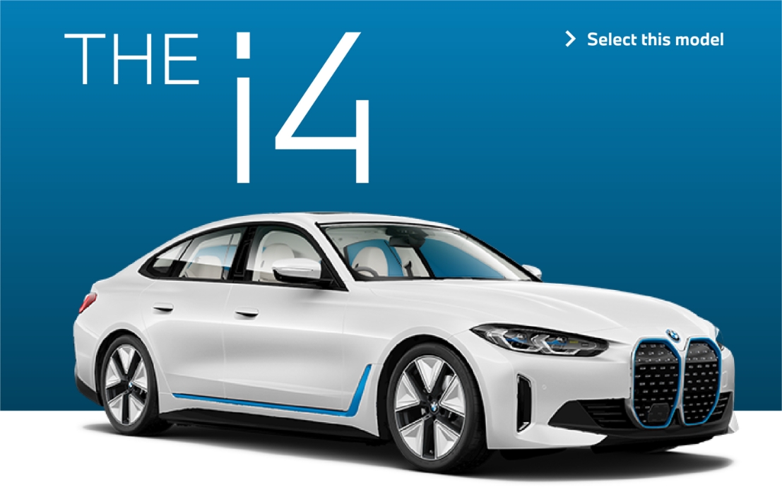
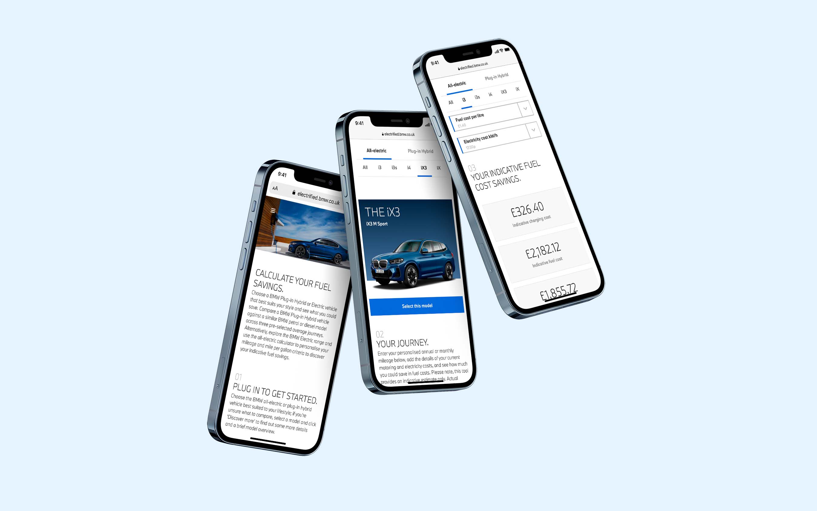
The design of the model tiles was key to injecting visual interest in the site. The BMW brand is predominately shades of grey with blue accents so creating stimulating and accessible designs can often be a challenge. The model tiles allowed us to utilise the paint colour of the cars being displayed and transition from a white model, to its coloured variant on hover or tap using a micro animation. Bespoke image retouches also feature throughout the design to add interest and for the user. Another challenge for the team was the amount of user inputs required for the calculators and what form they should take. Keen not to make the process visually repetitive by using the same input styles such as form fields, I carefully selected the right mechanism for each input and ensured variety throughout a calculator journey.Another challenge with working cross brand on a tool like this was sizing and spacing of individual component areas. Fonts and weightings are very different across the two brands and could have caused real issues, especially as the team were staggering the design phases, BMW first and then MINI. To overcome this and to avoid any potential clashes during any of the design sprints, I worked with the designers to install a library system of branded components that could quickly be rebranded and checked for viability. This meant that as full scale designs were being made for a particular area of a site in any given sprint, designers could work along side that sprint, validating brand and design decisions across various elements.
Next Project
Mark Meacher
mark.meacher@gmail.com